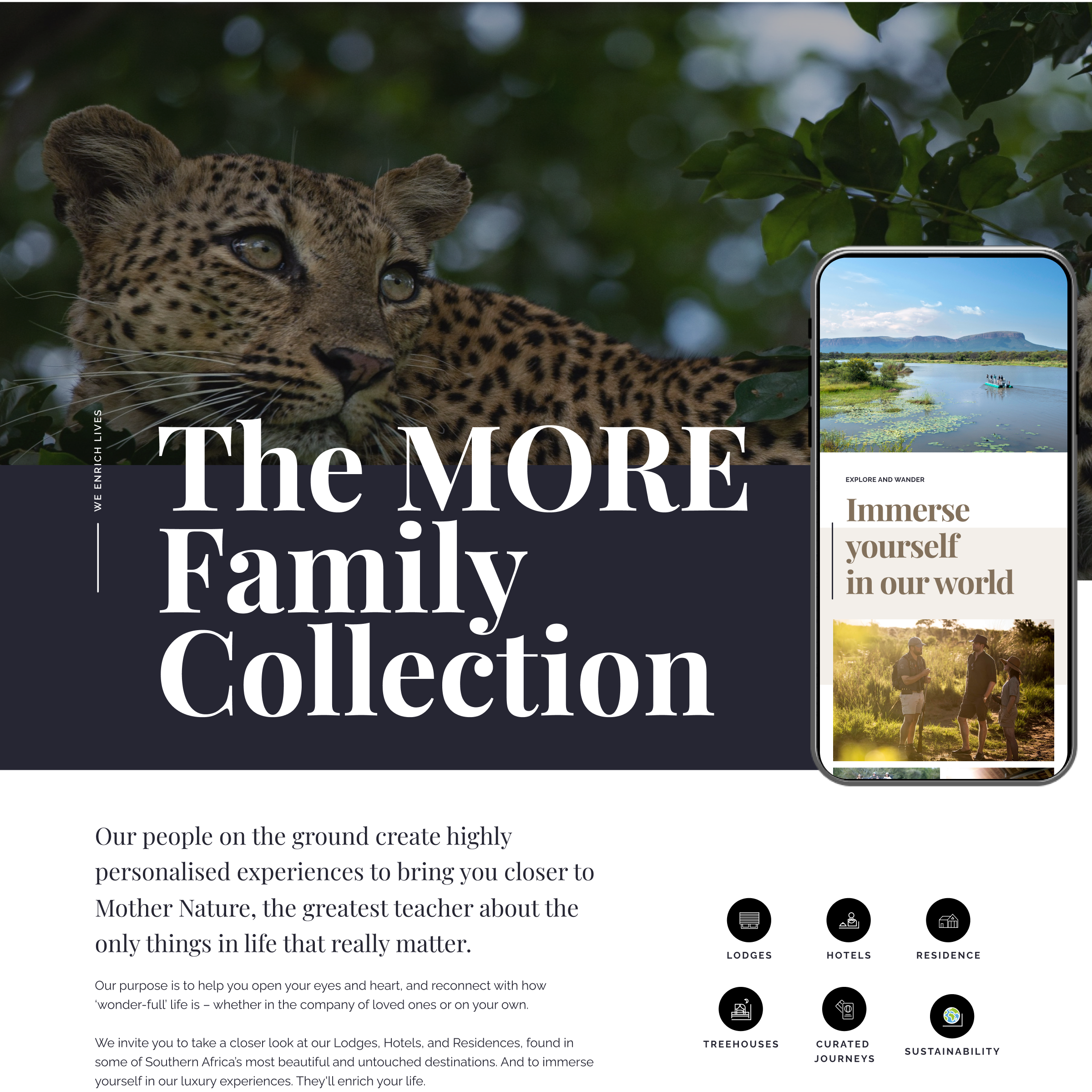
Optimising discovery, elevating every step of the journey.
Designed to delight and excite.
The brief for MORE was to review the existing website and identify opportunities for optimisation, increase lead generation, simplify the booking process and elevate the package holidays offering ‘Curated Journeys’.
ROLE
Lead UX designer and strategist
TIMELINE
4 months (March – June 2023)
TEAM
Collaborated and led a junior UX designer. Work closely with UI designers and, the development team.
Project background
MORE Family Collection is a family-owned business, luxury safari lodges and boutique hotels, set within some of Southern Africa’s finest locations.
While the website was robust, users were struggling to navigate between the different lodges and locations, leading to confusion about what each property offered and the unique experiences available.
To uncover key friction points, we conducted an in-depth analysis of their usage data and Google Analytics. The client’s business goals were to increase sales and get more enquiries.
We also aimed to make it easier for users to explore, enquire, and ultimately book their holidays. Leveraging visual storytelling to better highlight the landscapes, wildlife, and atmosphere of each location, ultimately bringing the experience to life.
Discovery phase
Assessing the present to Shape the Future
Current state audit and analysis
We began by looking inward, conducting an in-depth As-Is Audit of key pages — including the homepage and individual hotel/lodge pages. This allowed us to identify current strengths, pain points, and missed opportunities within the user journey.
Throughout the discovery phase we also looked at emerging UX/UI best practices across the travel and hospitality industry, gathering inspiration and strategic insight and create a list of priorities that we can take into the define and develop phase.
Benchmark analysis
After looking inwards I wanted to get a better understanding of the industry, conducted a market intelligence and performed a competitive benchmark against leading travel and luxury accommodation websites.
Looking inside and outside of the category.
What we looked at:
Content heirarchy
Best practices
Structure and content heirarchy
Lead generation and Call-to-action placements
Key information and what they do
Market intel - Comparing hotel pages
Market intel - What the big players are doing well (Airbnb)
Findings
This helped us gain valuable insights into evolving user expectations, particularly in areas such as visual storytelling, booking flows, mobile performance, and personalisation.
Based on these findings, we developed a set of key priorities to optimise the website and booking experience:
Call-to-action placement: Ensuring CTAs are prominent and contextually placed to drive engagement.
Improvements to the information architecture (IA): Streamlining navigation and content hierarchy for better usability.
Highlighting key features: Clearly showcasing what sets our offering apart.
Introduction of a gallery: Enhancing visual storytelling through rich imagery.
Making the website more mobile-centric: Prioritising mobile performance and responsiveness to meet user needs on smaller screens.
Define phase
Translating insights into Strategy and Structure
With key insights gathered, we moved into defining the future-state experience by restructuring the website’s Information Architecture (IA). Our goal was to simplify navigation, reduce cognitive load, and make it easier for users to explore and compare the various lodges and experiences.
We started by mapping out the existing structure and user flows, identifying points of friction and unnecessary complexity. This led to the creation of a streamlined, user-first IA that prioritises discoverability, clarity, and conversion.
To clearly communicate the rationale behind our decisions, we developed a before-and-after comparison, visually outlining the changes made, the issues being addressed, and the opportunities each improvement unlocked.
Our approach
Develop phase
Every change was backed by UX best practices, principles of cognitive psychology, and inspiration drawn from competitor analysis, all thoughtfully adapted and iterated to suit the brand’s distinct character.
The result: a more intuitive, differentiated and conversion-friendly experience that clients could easily understand and get behind.
Starting with crazy 8 exercises and low fedility wireframing to gather inspiration and shape the new vision.
Low fidelity wireframess & exploration
Once we gathered our ideas, we rolled out the new structure across the entire site, beginning with the homepage. We then developed a consistent template for the lodge and hotel 'microsites' to ensure clarity and ease of navigation, presenting content in a clean, digestible format.
To support this, we created high-fidelity wireframes for testing and prototyping before moving into final UI design.
Building on the existing brand, we refined the current application to better showcase impactful imagery and highlight the overall experience more effectively.
Our Approach
Hompage UX & UI designs
Hotel & lodge template and rollout
Stanley & Livingstone hotel UX & UI design


