Arcus
ROLE
Experience strategist & User experience designer
TIMELINE
3 months (April 2024 – June 2024)
Project background
Arcus Infrastructure Partners invests in and manages European infrastructure assets, providing long-term capital for sustainable development.
We were brought in to develop a bold new brand proposition, website, and design system. To achieve this, we reimagined the typical Discovery, Define, Design and Develop (Double Diamond) process. Simplifying it to better meet the client’s needs, without compromising on the quality of delivery.
Given the short timeline to go live, the brand and visual identity needed to play a more prominent role in communicating the client’s offering. The website brief focused on redesigning the site by applying the existing content to a new, user-centric information architecture and structure.
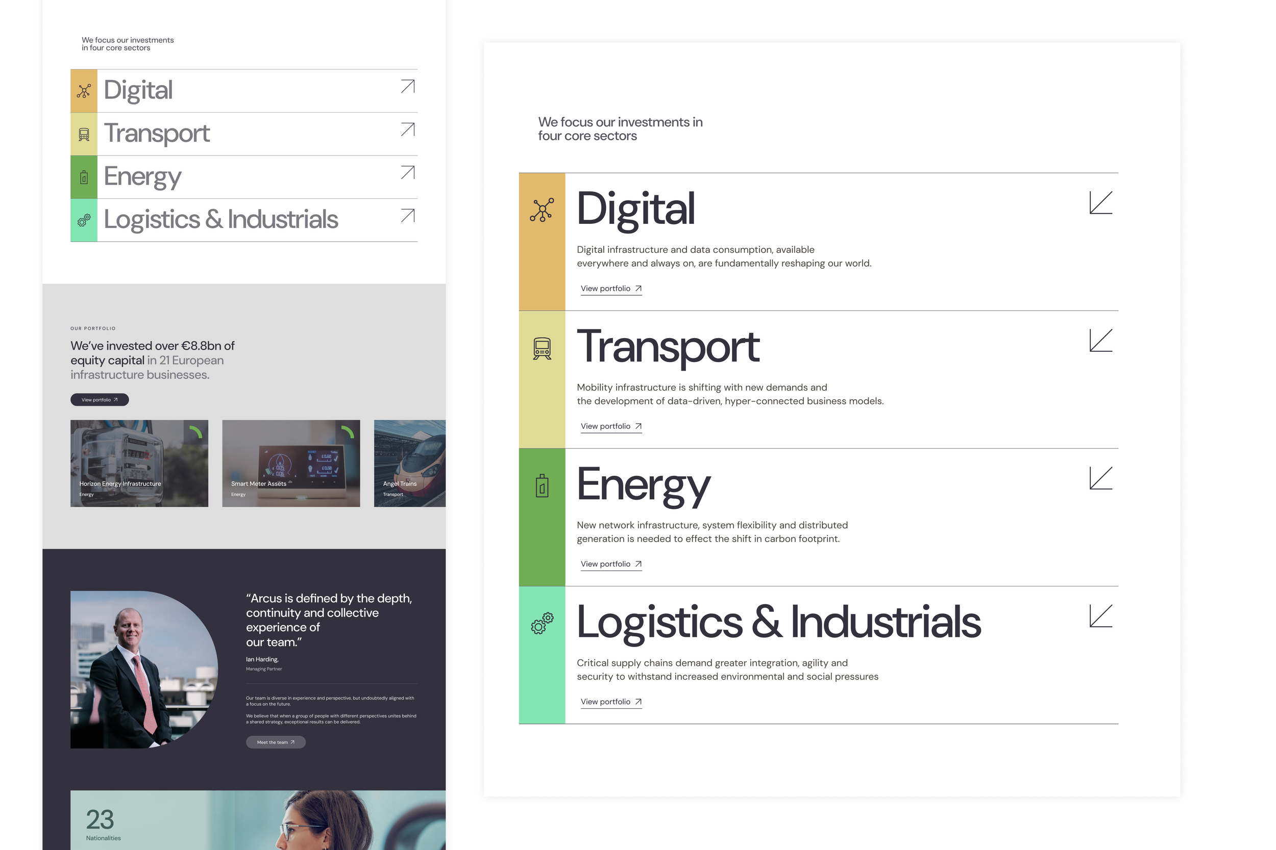
This was supported by a refreshed component library designed to communicate key information more clearly and effectively.
Discovery phase
Our focus was a deep dive and exploration scoping out what their competitors were doing in the space. Looking inside and out of the category to craft a standout proposition backed by a bold brand.
With strategy, and a focus on a new and simplified Information Architecture (IA). We designed and tested low-fidelity concepts early, creating fast mockups in collaboration with the client to better showcase their offering.

Exploration & Overview
Market intelligence deep dive
Market intelligence played a key role in shaping the brand evolution. By analysing competitors and industry leaders, we were able to identify what others were doing well and where there were opportunities to differentiate.
We focused specifically on how others communicated core themes such as sustainability, their company story ("About Us"), and how they presented their portfolio of clients.
This analysis highlighted best practices in storytelling, tone of voice, and visual presentation. It also revealed gaps in clarity, consistency, and user engagement that we could improve upon.
These insights directly informed how we structured content and designed key sections of the site to ensure that sustainability credentials were authentic and prominent, the brand story was compelling and human, and the portfolio was easy to navigate and visually engaging.

Market intel
Current state analysis and audit
During the current state audit, we conducted a comprehensive review of the existing website to assess its structure, content, and overall user experience. This helped us identify key pain points, usability issues, and areas where the current setup was not effectively supporting user needs or business goals.
The audit formed the foundation for developing a new, user-centric information architecture (IA). We combined these insights with a detailed competitive analysis and ran collaborative workshops with the client team to align on business objectives and better understand what was most important to their audience. These sessions were instrumental in shaping the content hierarchy, ensuring the new IA not only reflected industry best practices but was also tailored to the specific goals of the organisation and the needs of its users.

As-is IA & website

Findings and trends
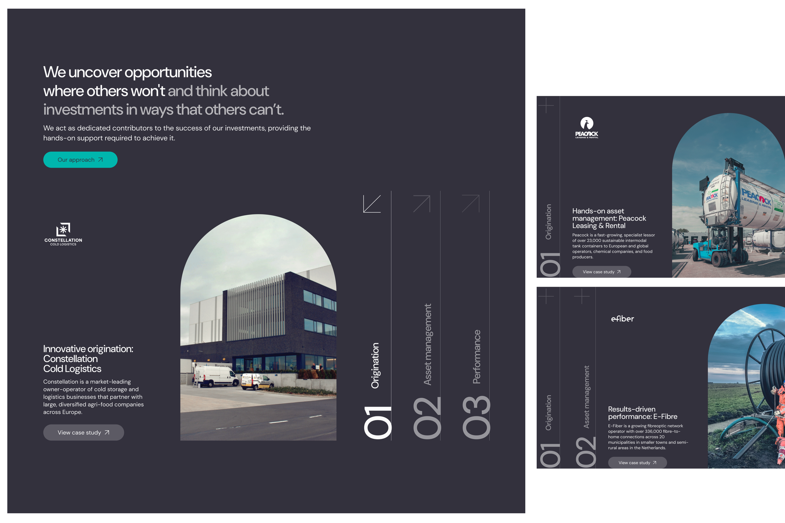
Striking brand, confident colours, and a sharp strategic edge, we set the stage for a whole new user experience.

Define & Design phase
New Information architecture (IA)
During the define phase, we explored multiple possible approaches to the information architecture (IA). Through user testing and collaborative workshops with the client, we ultimately opted for a simplified yet elegant IA solution.
Our goal was to make discovery as intuitive as possible while placing a clear emphasis on sustainability and how Arcus can support its clients.
The final structure ensures that key information is easily accessible without unnecessary complexity or deep navigation layers, striking a balance between clarity, functionality, and brand storytelling.

Information architecture (IA)
Low fidelity wireframes

Content structure & wireframes
Due to the constraints of the brief, we focused on creating low-fidelity wireframes to map out content placement within the predefined template. This approach was both efficient and effective, allowing us to quickly roll out the design while clearly showcasing the new information architecture and content hierarchy.
Given the absence of high-fidelity wireframes, I worked closely with the UI team throughout the rollout of the designs by helping to identify, design, and refine components that would best communicate the content. This close collaboration ensured the final implementation remained aligned with the strategic intent behind the IA and content structure.
Gallery
Low-fidelity wireframe
Previous website homepage experience
UI design